Welcome, fellow wonks!
So, I looked at about 30 different cozy/traditional mystery author websites and took notes on what kind of sections they included in their top-level navigation. Here’s a table which details what I found.
| Section | Percentage of sites with this section (roughly) | Various titles for this section |
|---|---|---|
| Home | 70% | Home; Welcome |
| About Me | 100% | About Me; About [author’s name]; [author’s name]; About; Author; Biography; Bio; Bio/Contact |
| Books | 85% | Books; My Books; All My Books; Books and Stories; [author’s name] Books; Bookshelf; Now and Future Books; Mysteries; Bibliography; Bibliography and Reading Guide; [Name of series]; [main character’s name]; [author’s name name of series] |
| Contact | 85% | Contact; Contact Me; Contact [author’s name];Mailing List and Contact Info; Contact and Links; Bio/Contact |
| Calendar | 55% | Calendar; Schedule; Appearances; Events; Tour Schedule |
| Blog | 50% | Blog; [Name of Blog]; Blogs; Facebook; Journal |
| Media | 35% | Media; Press Kit; Media Page; Media Kit; Links and Press Kit |
| Different series | 30% | [names of different series on different tabs] |
| Other genres | 15% | [name of genre] |
| Newsletter | 30% | Newsletter; Mailing List |
| News | 30% | News; News and Events; News & Events; News/Events/Photos |
| Reviews | 20% | Reviews; Press; They Like Me |
| FAQ | 15% | FAQ; FAQs; Q&A; More… |
| Store | 15% | Store; Where to Buy; Buy; Ordering Signed Books |
| Photos | 15% | Photos |
| Recipes | 15% | Recipes |
| Awards | 10% | Awards; Awards & Nominations |
| Various other tab headings | These showed up once or twice | Available Now; Audio Books; Video; Links; Programs; Workshops; Contests; Giveaway; Book Clubs; Discussion Questions; For Writers; On Writing; Getting Published; Settings; Pronunciation Guide; Sample Chapters; Essays; Online (other online pieces by author); For Fun; Etcetera; pages for particular causes; |
You can see I recorded variations on the page titles used – some short, some long, some friendly, some serious. To me, those titles sometimes made an interesting difference in the tone of the website, and some appealed to me more than others. Do you find that, too? Or do they all seem about the same?
By the way, the brackets in some of these page titles stand for the particular author’s information. For instance, in “Books,” if I was going to use a similar title for my own page,
- [author’s name] Books would be Kathleen Wendorff Books;
- [Name of series] would be a section labeled Wisconsin Nice Mysteries;
- [main character’s name] would be a section labeled Alison York (who???);
- [author’s name name of series] would be Kathleen Wendorff Wisconsin Nice Mysteries. (Quite a mouthful.)
More wonkiness on how many sections to include
I’ve read a lot of books and articles on web site design, and they generally agree you should stick to 4 to 8 different sections in a navigation menu. (Some articles disputed this common wisdom, and recommended you include as many sections as your material needs.) But including too many sections makes your page cluttered and confusing, and the menu “tabs” get too narrow to read.
Luckily, as we saw in the previous post, there’s a cluster of 6 basic sections used by at least half of the author websites I checked. As a reminder, here they are:
- About Me (included in 100% of the author websites I checked)
- Books (85%)
- Contact (85%)
- Home (70%)
- Calendar (55%)
- Blog (50%)
That fits right in the 4 to 8 section range, which is probably not a coincidence.
Still, that’s only about half the websites, and there was actually a wide range of “number of sections.” Here’s a graph that shows the distribution. (There was one website with 4 sections, 2 websites with 5 sections and so on.)
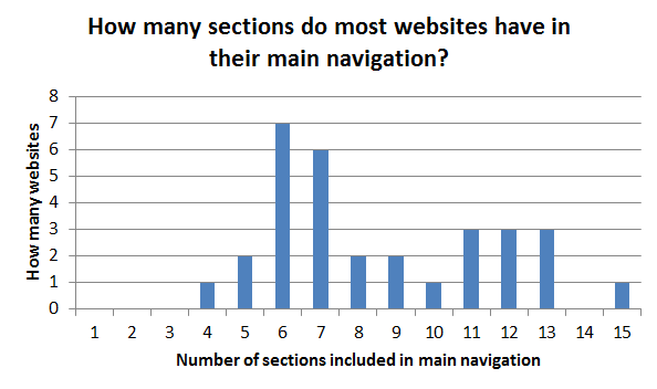
You can see there were a number of websites with 11, 12 or 13 choices, too. And there are certainly a whole raft of great ideas for other sections — reviews, recipes, press kit, newsletter, excerpts, links, giveaways, where to buy, and more.
To me, some of those websites with many sections seemed busy and confusing – but some were clear and easy to navigate. My impression was that you can manage lots of sections – but it’s trickier to do well.
Another approach is to stick with the basic 6 sections in the top-level navigation menu, and make the other sections sub-pages or subsections, a level down, reachable by secondary navigation. If you set up a logical step-by-step navigation structure, your visitors will find them easily.
Which brings up the whole issue of navigation…
(to be continued)